|
The first part to art criticism is to describe the artwork. What I mean by that is looking at the little things in your artwork, what you see in it, what would you say about it if someone were to ask you about it, what did you do. the second part is analyzing the artwork. This one is all about colors, values, shapes, texture, etc. Its your art elements. Third part is interpreting your art meaning what does this art work make you feel. What's the story behind it? what does it represent? The last one is judging the artwork which is what do you think of it and was it successful and if it wasn't why? and what would you to change it.  I learned a lot from this piece. If I had to describe my work I would say that I really like how the colors look together. the background is yellow and my dad has a blue hat on. he has a big jacket on that is black and plain white shirt on. my moms right beside him and has a blue shirt on and her hair is short. These are my parents. analyzing my artwork. I like how the blue and yellow and the skin go together. the value is the light and dark go together. The texture to the hair and the jacket really balance. you can tell the variety of colors I used for the skin tone and the shades to it. interpreting my art, I used prisma colors to do all this. this drawing makes me feel excited because its my parents and I'm really proud about how it came out. this represents the love I have for my parents even though a drawing isn't better than the real thing. judging my art, I think I did really good if I could change something I'd do more shading or try and work on my shading with the neck and stuff. I also really like the texture added to the face features. I think I could do way better on the teeth because i didn't really know how to do them and I want to learn how to do them good. questions: 1. what is the point of this class? what did I get from it? I think the point of this class is learning and probably helping you see if you're interested in art. this class for sure has helped me learn way more things of art, like more techniques and helped me be more creative and try new things in art. I really like art and I feel like I'm creative and this class helped me with the things you can do with art and there's a lot. 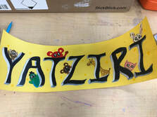 2. choose one art piece and explain your growth as an artist and find techniques and stuff you learned from other pieces you've done. this isn't a piece we've done In class but this one I did after some time after a couple projects. the watercolor one I didn't really know how to do sunsets but honestly I think I have gotten better once we did practices. I always loved drawing but there's time where I think my drawings aren't good enough and then I don't like to draw for a while but taking art has helped me a lot to draw way more and keep drawing no matter what. I really like painting I have realized taking this class.  3. do over, if you could what project would you do over and what would you change and how. if I were to choose what project to do over I would do the Lino cut I feel like I could've done something way better. I had a lot of designs and not a lot of time. next time I would manage my time and do something more interesting and something harder because I feel like I could've done something more challenging and challenge myself. I would do something different like maybe have a lot of turtles swimming and adding things to the sea. 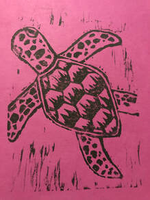
0 Comments
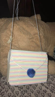 pros and cons about this project. some pros were I really like how the pattern looks good through the whole purse. its not to much and not to exaggerated just a simple cute little purse. I really like the fuzz ball I put on the purse where you open it. some cons would be how I had to cut down some and didn't come out all good. another con could be not adding straws to the side edges where you still see the cardboard.
pros and cons for this art piece. A con was probably doing the letters with the paper and making it the way you want it. Also another one is the shading you do for each letter. Some pros where the little animals I did on each letter I really like how they came out. I also liked how the Prisma colors looked on the yellow paper especially the black and white. 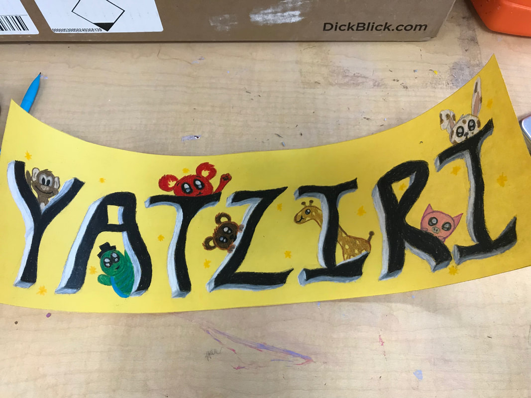 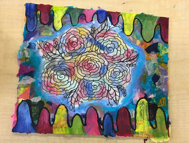 I used 5 different mediums and techniques. The first one I used was drawing the flowers in the middle with marker and adding some designs like leaves around it. The next thing I used was watercolor paint I put it on top of the flowers I drew to add colorfulness to it, it was different colors with the flowers. After that I added tissue paper around the flowers sort of the same color to the colors in the flowers. I added paint acting as if it were dripping in the bottom and top and also used colors similar to the rest. The last thing I added was chalk pastel around the flowers to make them pop out the most with the light blue glowiness to it.
 I did a portrait of my parents. I used prisma colors to do this portrait. I had to find the proportions of the face and then start coloring and using different shades of colors to get the perfect shades for them. I would change some textures of the face o some of them and maybe fix the color. What I think was successful was some of the proportions of the face and I really like how the background looks with the colors and how the shading looks in my father's jacket. 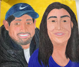
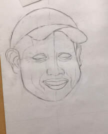
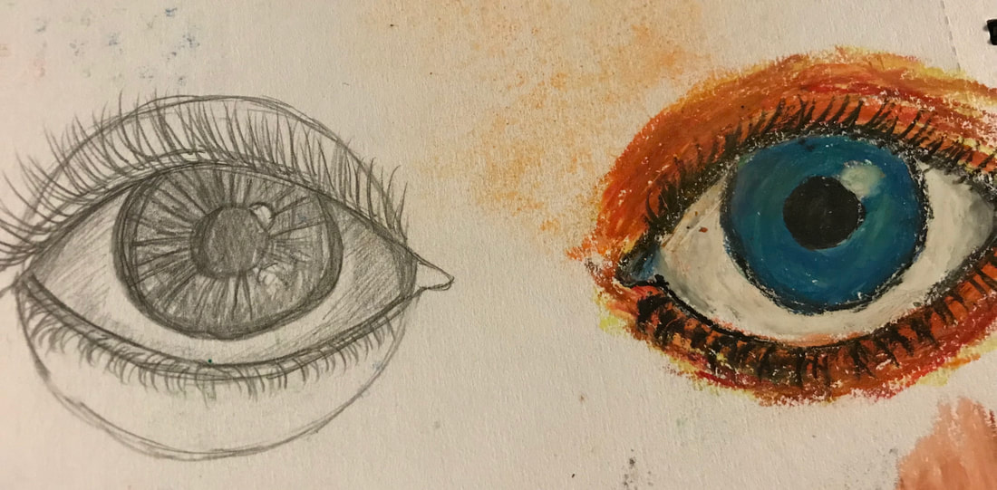
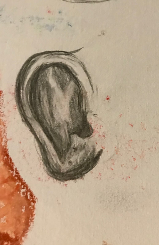
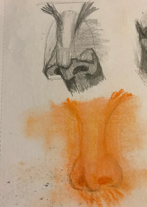
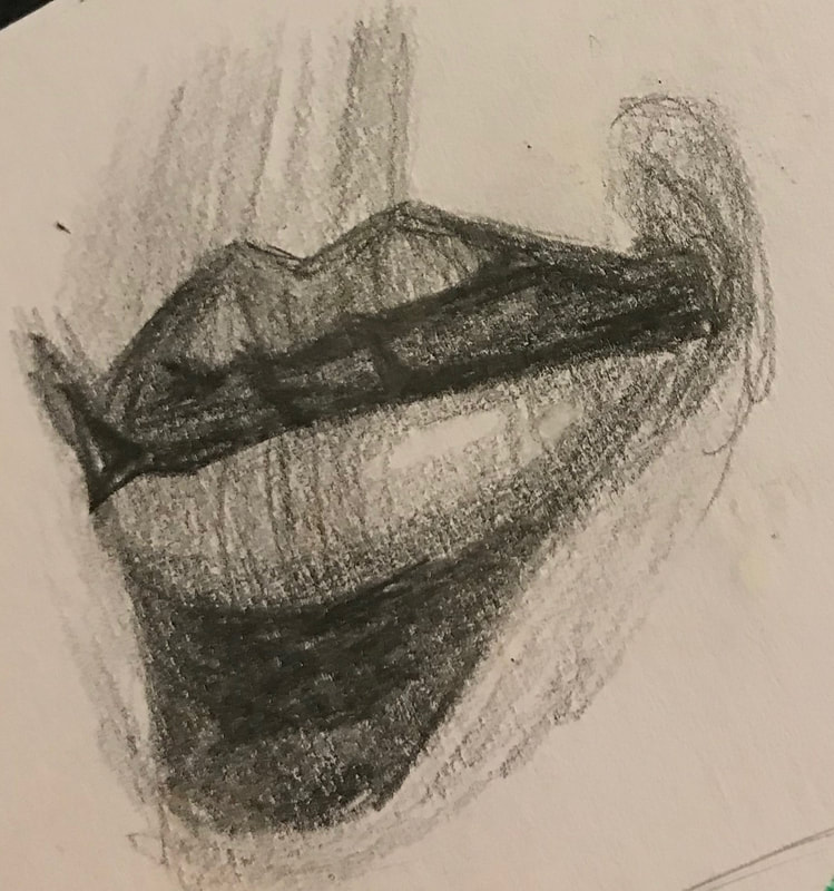
They were all pretty helpful to me but the one that helped me the most would probably be the nose and eyes because I always have trouble drawing those. What I found most surprising about the facial proportions was how the shading in the ear really makes a difference an so does in the lips.
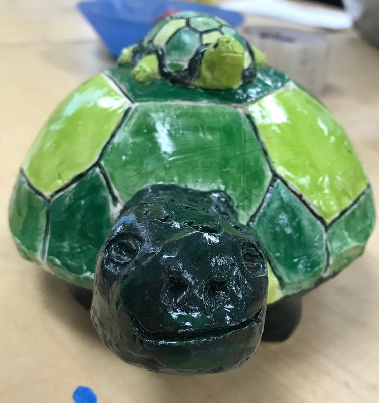
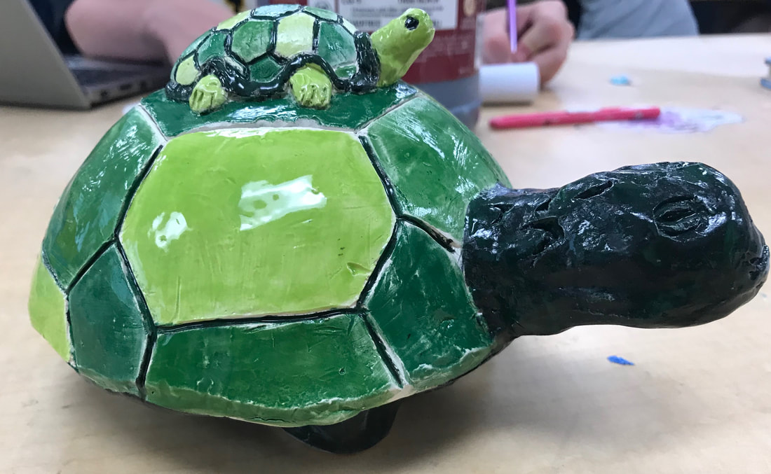
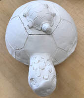
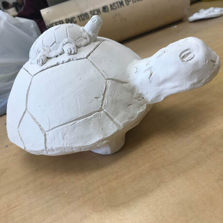
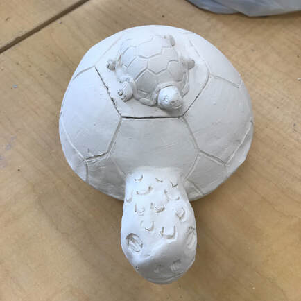
My clay tray is going to be used to put stuff like bracelets or necklaces in. I came up with this idea because I really like turtles and I just thought this idea will look really cute with the little baby turtle on top. My process with this was using a lot of techniques like pinching it to get the shape of the turtle head and feet. I also did the mold technique to the shape of the shells.
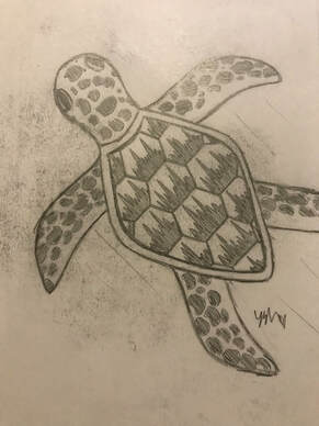
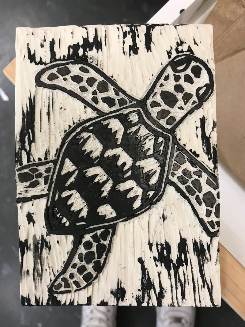
 My drawing shows off the theme of "line" because of what I added to the turtle shell the design on each part of the shell, also the lines in the background. My piece is successful because the line in the background make it seem like its in water, and I really like how my design on the turtle came out good. If I could change anything it would probably be the lining of the turtle. I would make it a bit thicker.
|
AuthorWrite something about yourself. No need to be fancy, just an overview. Archives
June 2019
Categories |
 RSS Feed
